Responsive Web Design: Bringing Your Vision to Every Device
Elevate Your Website with Responsive Web Design
Transform Your Online Presence: Experience seamless browsing on any device with our expert web design services.
At CMS Live, we specialise in creating stunning, functional websites that look perfect on every screen, from desktops to mobiles. With over a decade of experience in web design, we know how to enhance your business’s online presence and ensure your website stands out.
NEW WEBSITE
Do you need a new website?
We build stunning, modern, and functional websites that engage and connect with your audience.
Find out more
EXISTING WEBSITE
Do You Need Support with a website?
There are a lot of reasons web design projects can fail. As Web Specialists we can build on what you already have.
Find out more
Elevate Your Website with Responsive Web Design
Problems with Non-Responsive Websites:
A non-responsive website can drive visitors away due to a frustrating user experience. Additionally, search engines favour mobile-friendly websites, so having a non-responsive site can result in lower search engine rankings. This poor mobile experience can ultimately lead to lost business opportunities and decreased revenue.
Our Web Design Services
We offer a comprehensive range of services to ensure your website performs flawlessly across all devices:
Custom Website Design
Tailored designs that reflect your brand and engage your audience.Mobile Optimisation
Enhancing your website’s functionality on mobile devices.Flexible Grid Layouts
Ensuring your site’s content adapts smoothly to different screen sizes.Touch-Friendly Navigation
Making your site easy to use on touch devices.Fast Loading Times
Optimising images and code for quick access, even on mobile networks.Cross-Browser Compatibility
Ensuring your website works seamlessly on all popular browsers.SEO Integration
Implementing best practices to improve your search engine rankings.
Why Choose CMS Live?
Expertise in Responsive Web Design
We bring a wealth of knowledge and a passion for crafting websites that are both beautiful and functional on all devices.Custom, Client-Focused Designs
We work closely with you to create a website that’s uniquely yours, tailored to meet your specific needs and goals.Experience with Diverse Industries
From retail to finance, our extensive portfolio showcases our ability to adapt to various industries.Commitment to Quality and Client Satisfaction
We pride ourselves on going the extra mile to ensure our clients are delighted with our services.Experience and Credentials
With a history of excellence dating back to 2007, we have the expertise and proven track record to deliver top-notch web design.
Partner with CMS Live and transform your website into a dynamic, engaging platform that performs flawlessly on every device. Contact us today to start your journey towards a responsive web design that drives success.
Services Tailored to You
We understand that every business has unique needs.Therefore, we offer a flexible range of services across three main areas: Build, Support, and Grow.
Whether you're a business owner looking to establish an online presence, or a website owner in need of ongoing maintenance and marketing, you can choose the combination of services that best suits your needs.
Build
Our web design and graphic design services help you create a stunning and effective online presence.
Whether you're starting from scratch or looking to redesign your existing site, we ensure your vision comes to life.
Support
We offer reliable web hosting and comprehensive care plans to keep your website running smoothly.
Moreover, our support services ensure that your site remains secure, up-to-date, and performs at its best.
Grow
Our digital marketing services are designed to help your business reach new heights.
For example, from SEO to digital marketing, we have the expertise to boost your online visibility and drive more traffic to your site.
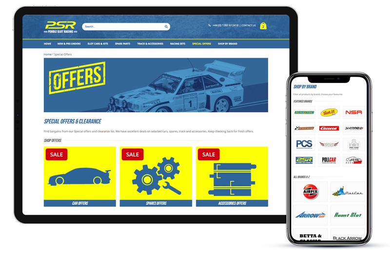
CMS Live were recommended to us through a joint business partner and we haven’t been disappointed. They have met our deadlines and understood what we wanted. We are looking forward to working with them on more projects in the future.Mark Attwell - Operations Director
The guys at CMS have provided us with a professional, personal and very reliable service during the design, build and ongoing development of our website. A first rate serviceMatthew Walker, Donald Lomax & Partners
CMS have hosted my old website for 3 years. It really needed an overhaul and to be fit for purpose. I am under no illusion, I am picky and hard work!! 🤣 Gemma was so patient with me and totally understood what I needed from the website. It looks amazing and works so well. Thanks so much!!Danielle Coates, Owner of The Rookery Roughlee